Hi, I'm Paris.
I'm a User Experience designer that wants to make life just a bit more enjoyable and easier.Currently based in San Diego, CA
My Work
In Progress Projects:
ENG100L Developing an educational game to teach children about Diabetes and its risks.

Physical + Digital Design ━ An interactive kiosk meant to solve user issues revolving around the POP Mart store.

App Design ━ An app built to assist those new to cooking on their own. Done for a Hackathon.

Concept Redesign ━ An unsolicited redesign YouTube's subscription notifications.

Design Sprint ━ A 2 day design challenge for AskClass, an interactive engagement-based classroom learning OS for students.

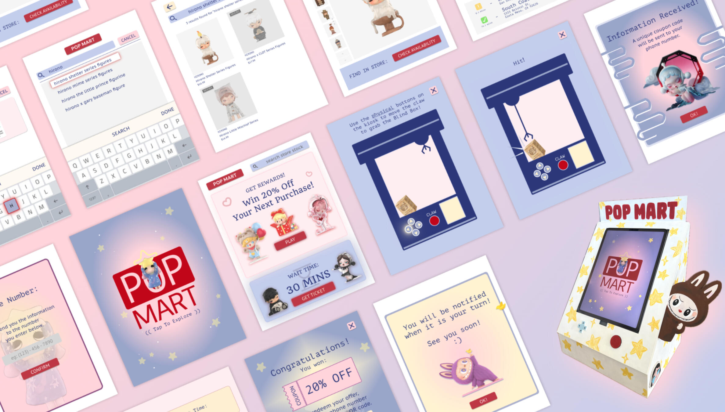
POP Mart Interactive Kiosk
Design ━ An interactive physical kiosk and digital design, A class project for DSGN 100- Prototyping
Timeline ━ 6 weeks of Spring Quarter 2025
Team ━ Paris, Serene, Hannah
Role ━ UX Designer & UX Researcher
Tools ━ Figma, Inkscape, UCSD Makerspace Laser Cutter
Background
What is POP Mart?
POP Mart is a Chinese store that is most famously known for selling figurines and popularizing "blind boxes," which contain a series of figures where customers do not know which figure they will get.Objective
Our main focus was to build an interactive kiosk that provides a solution to user needs at a specific location. We chose a POP Mart store closest to us at a local mall due to personal experiences with store problems.Mission Statement
We aim to design interactive kiosks that solve everyday problems for smaller-sized Pop Mart stores in popular malls or cities, enhancing the shopping experience through increased efficiency and convenience for customers.
Research
Designing Around The Problem
The first step in designing a solution for POP Mart was to figure out what problems people encountered and why.
We decided to focus on the POP Mart store located at the Westfield UTC Mall in La Jolla.Competitive Analysis
When designing an interactive kiosk, similar kiosk functions we took note of were:
- Self checkout kiosks (ie: Walmart)
- Self ordering kiosks (ie: Boba Shop)
- Reservations/waitlist kiosks (ie: Korean barbecue reservation)
- POP Mart UTC's Vending Machine
- Grocery Store physical ticket number and call systemOnline Research
To uncover the experiences of customers, we used online reviews (ie: Google/Yelp), forums, and comments on social media groups and posts. We found that:
- Stores are visually aesthetic and have strong branding
- Displays are well organized and push new releases/popular figures
- Blind boxes are exciting and compelling
- Figures are good quality
But.
- Most popular figures are pricey at around the $20 price point
- Customers usually wait hours, or even overnight, for new/rare releases
- Lines are long, especially on weekends
- It's impossible to know when products will go back in stock
- Hard to tell what products are actually in stock due to displays and no online option to checkField Research
The next step was to conduct field research. The 3 of us went out at different days and times to the POP Mart UTC store to observe and gather insights on how users interact and do certain things in their own context. We took hollistic (structural, sensorial, and behavioral) observations and also did in person interviews.
Based on all of our observations and interviews of both employees and customers, we learned that:- The average wait time for the line was 5-15 minutes on weekdays, 15-30 on weekends.
- Most displayed figures were sold out or unavailable
- The POP Mart vending machine outside is not crowded and rarely has a line, but does not have popular/hard to find figures
- Many customers are at the store to check if a certain popular figure was in stock
- The store is brightly decorated with a maximalist aesthetic

Story-boarding
To illustrate our target audience and where they would encounter potential conflicts that the kiosk would solve, we first created 3 different personas. and put them into 5 different storyboard scenarios. Below are the personas and some of the storyboards.

Based on these storyboard scenarios, we interviewed 5 different people and asked them about their opinion, experience, and emotions based on the storyboards.
Identified Problems
Based on the feedback on the interviews, the solutions are identified to implement into a kiosk located outside of POP Mart to resolve these issues.- Long line
- Unknown store stock
- Conflicted on spending on expensive merchandise

Elements of the Kiosk
Target Goals of the Kiosk
- Allow people waiting to be more productive with their time by providing an estimated wait time and a text for when it is their turn.
- Give the option to check store stock before committing to waiting in line and finding out in store.
- Interactive game to promote rewards program + an incentive to spend at the store.Target Features
- Arcade style buttons to match kiosk claw machine game
- Real time in store stock updates
- Strong branding with signature colors + characters
- Realistic line wait times + queue position updates
Building the Physical Prototype
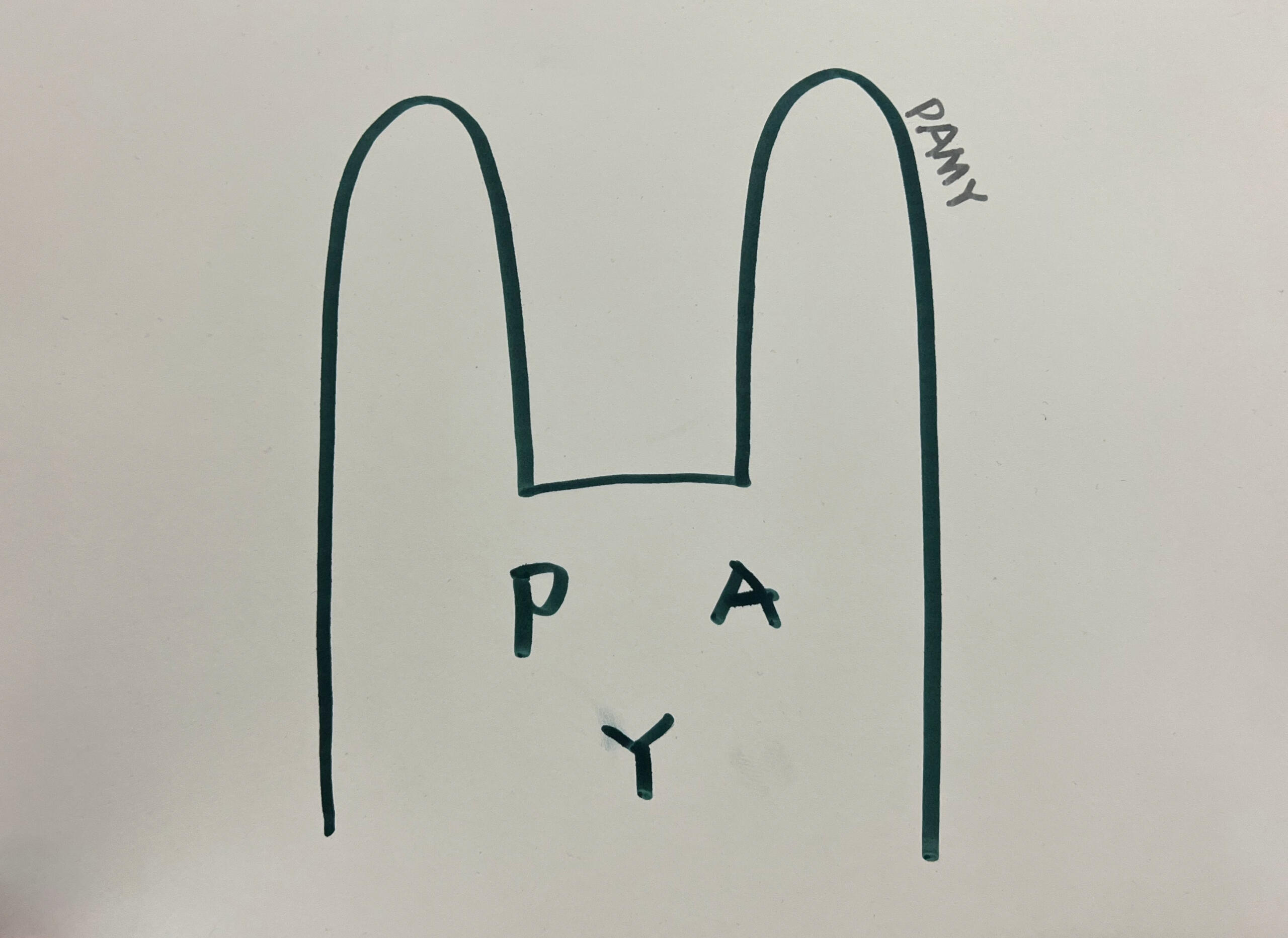
I was in fully in charge of building the physical kiosk. Using the UCSD Makerspace materials and our own technology meant compromising on the target kiosk design due to manufacturing limitations. I was limited by the amount of wood material I could use and needed to use Hannah's iPad as our interactable screen.Initial Planning
To start, we drew up a few structural and branding designs to be tabletop-sized that also fit Hannah's iPad. Based on that, I made a cardboard model to dimensions of the kiosk, visualize the angle where one would interact with the screen, and to overall see how it looks and feels before committing to the design.


Design of Final Cutouts
After prototyping the physical design, I moved on to creating the graphics and measurements for laser cutting the wood. It was really important to consider tab cutouts for our own testing purposes when putting the iPad in and out of the display, the width of the wood to make the design completely flush on all edges, and the interactive button elements.

Due to UCSD's Makerspace being extremely crowded and booked, I needed to make sure my measurements were perfect because I wouldn't have another chance to cut.


After cutting, pieces were assembled using wood glue and painted with acrylic paint.
Digital Prototyping in Figma
To start on our digital prototype, we our research to narrow down 3 main functions.
1. Display a queue time estimate
2. Ability to check stock
3. Incentives to make in-store purchases, which will be integrated with an interactive game on screenGiven these, I brainstormed and sketched dozens of screens, hideous or not, to visualize the flow and spacing.


With these rough flows, we made our first low fidelity iteration with multiple screen variations to visualize lay out what might look best for our flow.

With the rough flow mapped out, Serene and I worked on creating screens and graphics that encouraged strong POP Mart branding.

On Iteration 3, the physical kiosk had been built and painted, so we conducted 3 interviews where the user was able to interact with the physical and digital elements combined for an immersive experience.

User Testing
In these interviews, we tasked the users to:
1. Get a ticket for the waitlist
2. Win a coupon code for your next purchase
3. Check availability of a product in storeFrom their experience in the process of completing these tasks, we asked them a series of questions about their experience with both the physical and digital elements.


- 2/3 interviewees were unsure on whether to scan the QR code or press a button on screen to fill in their contact information
- All interviewees enjoyed the "cute" aesthetic of the kiosk and had fun playing the interactive claw machine game
- Interviewee #1 suggested making the font under each figurine in the store stock page larger to be more legible for a wider audience
2/3 interviewees states that the wait time and "number of people ahead" function would be very helpful in a real-world setting
View the changes on the slides below.
In addition to the feedback changes, Serene and I worked on making hi-fidelity and on-brand screens for the finished prototype.View the finished prototype below!
Future Iterations
Due to our limitations on creating this POP Mart kiosk, we were limited to a small (12x9) screen size, a lack of material, and time. This iteration represents the concept and is executed on a smaller scale screen.The intended size is comparable to a mall map directory and the intended location is around the front of store that is easily accessible and visible to people passing by. In future iterations, we would like to see...- A larger screen that would constantly display the queue and wait time. This is important because the long line is a deciding factor for potential customers walking by.
- More indepth rewards details + a way to obtain a membership through the kiosk.
- Diverse sorting/search options (ie: characters, accessories)
Updated Mission Statement
We aim to design interactive kiosks that solve everyday problems for smaller-sized Pop Mart stores in popular malls or cities, enhancing the shopping experience through increased efficiency and convenience for customers.By streamlining operations for lines, incentivizing customers to promote rewards, and providing information for in demand products, we aim to drive engagement and increase customer satisfaction.
Takeaways
This project was very fast paced, a lot of work, but was very rewarding and fun. For me anyway. I learned I really enjoy builing physical things and I'm extremely proud of how sturdy, flush, and well made the physical prototype is. The amount of time that goes into working on multiple iterations in Figma took much longer than expected, especially since it was just Serene and I. I also learned a lot about conducting research and how to actually approach a real world issue through this project. Communicating to collaborate with a group is always difficult, especially when things don't meet our expectations and we all have different schedules and school work to balance. I am very proud of this project and in the time it took.
Figma file linked below. Contains:
- Lo-fi prototype
- All iterations
- Style Guide and Moodboard

Group picture of Serene (left), Me (middle), and Hannah (right).Demo day of our finished kiosk.
AskClass
Design Sprint ━ A 2 day design challenge for AskClass
Timeline ━ All design work done in 48 hrs / December 2023
Team ━ Paris, Alice, Madeline, Yeesul
Role ━ UX Designer & Researcher
Tools ━ Figma
Background
In classrooms, students have a hard time building friendships, communicating, and staying motivated. AskClass aims to make a relationship-based classroom OS so that students can build social and emotional skills.
Challenge
Since this is a design sprint held by AskClass, we were given the task to create a solution that improves the collaboration process in the classroom.
"How might we help college students experience better collaboration in their team projects?"
Research
Keeping in mind AskClass's mission, we started by interviewing several San Jose State University professors to learn more about them, the class, and about what classroom collaboration problems they might be struggling with.
- What class do you teach?
- What percent of grade goes to team projects/participation?
- What works well in group assignments?
- How do you form teams?
- Any pain points with team projects?

Results & Pain Points
Professors...
- dedicated anywhere from 30-75% of the total grade to group work and participation.
- have existing ways to create teams.
- have existing ways to check group progress.
- were also easily able to inform team of roles and responsibilities.
- struggled to produce balanced teams.
- struggled to produce teams for bigger classes
Identifying the Problem
Professors struggled to group students in an efficient and effective manner.
Brainstorming & Solution
"How might we help college students experience better collaboration in their team projects?"
To answer this question, our team brainstormed a couple of concepts. This included resolving in-group conflicts, a peer evaluation rating, and an integrated filtering system.
Our group decided to focus on the issue of grouping students, especially due to larger classes.
"How might we make the grouping process easier?"
On WHAT to group students by, a more relationship based choice would be based on personal questions given by a survey. An example of the survey tests students would be grouped together or separately includes college major, hobbies, personality, interest, work style, availability, leadership, and (of course) more customizable options.
On HOW to group students, our team decided it would be optimal to allow the user to use a number of filters based on the survey tests, a random grouping function, and a more controlled manual grouping.

Prototyping
Paper Prototyping
I made the general flowchart below of the process a professor would experience when grouping teams and proposed it to the team. From there, we agreed on this process and started creating another iteration of this process.

In the next version, a more visual layout was used to highlight the three functions our concept offers-- filtered, manual, and random grouping. We also took more time on how a professor would interact with the students profiles in the grouping process. Bigger images of the students were used along with flagging options for easier recognition.
Due to the lack of time, we were unable to do more iterations and critiques and went ahead to start prototyping in Figma.

Digital Prototyping
Since only two of us knew how to generally use Figma at the time, prototyping was very slow, but I believe we demonstrated our concept.
We also followed branding guidelines including AskClass's color scheme.
Final Product
After finishing our prototype, we presented our matching method to the professors we had previously interviewed in contest with other teams. In the end, ours was voted the most popular by the professors and participants.

Takeaways
Overall, this project introduced me to the UX design process and taught me what it was really like to go through all of these steps. Setting clear goals, the research process, the designing, redesigning, and taking other people's ideas and feedback was very insightful in learning what it was like to design and work as a team.
I believe our biggest constraint was time, but from this, I got to learn how to make basic designs, how to prototype and implement a flowchart, and overall got more familiar on how to use Figma. This experience was very valuable to me as it was my gateway into the tools and thought process used in the design space.
Spartan Racing
Website Redesign ━ A complete redesign of San Jose State University's Formula SAE Racing Website
Timeline ━ Started in Nov 2022, maintained until Aug 2023
Team ━ Paris Tan
Role ━ UX Designer & Researcher
Tools ━ Wix, Figma, Adobe Photoshop & Illustrator
Background
San Jose State University's Formula SAE Racing Team, Spartan Racing, is one of the best teams in California. Formula SAE is a yearly competition where college teams around the globe design, build, and race their cars in various categories.
The Problem
Spartan Racing is student run, and a large portion in being able to build amazing racecars is heavily dependent on funding and sponsors. With the website being outdated, hard to navigate, and I volunteered to redesign it.
The Process
Text
Takeaways
I am extremely passionate about x, so it was easy for me to work idk
YouTube Notifications
Unsolicited Redesign ━ An unsolicited redesign YouTube's subscription notifications.
Timeline ━ ~3 months during my free time
Team ━ Paris Tan
Role ━ UX Designer & Researcher
Tools ━ Figma
Background
Today, YouTube is one of the biggest and most used streaming platforms available, but there are many obscure features you've probably never seen before, or even used.
I decided to start this project due to my own personal experience with the subscription notification feature on YouTube.
Problem
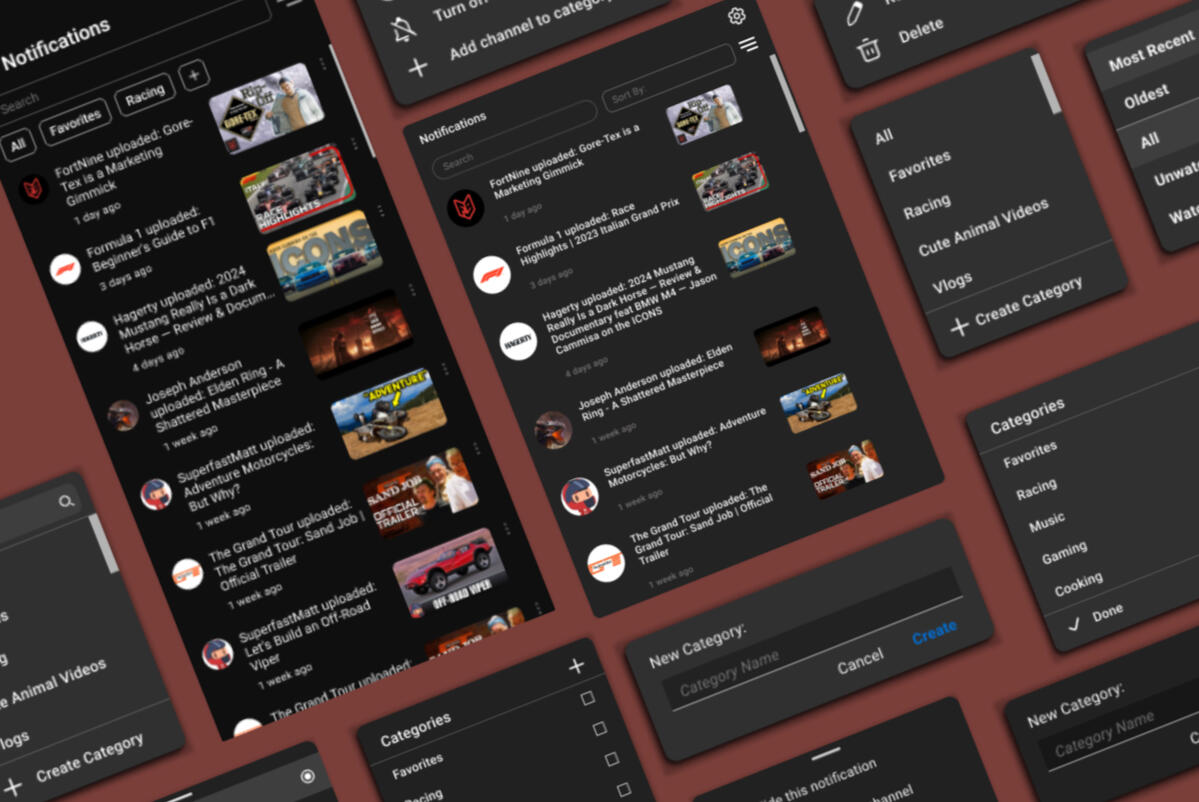
Located at the top right corner of the screen is a bell icon.
This feature's main function is to notify you about new videos from subscribed channels.
Instead, it is inefficient, linearly redundant, and uninteresting.
Research
To learn more about how people interacted with the notification system, I conducted surveys and interviews to find more specific pain points.

To the average viewer, it is a poorly optimized mess.
- Unwatched and watched videos are clumped together and hard to differentiate
- Scrolling is redundant and takes too much time
- Many feel overwhelmed by the amount of notifications, especially from irrelevant channels
- There isn't an easy way to navigate the notifications
To better design for the problems this function created, I created a user persona and journeymap. The goal of this was to understand and put myself in someone else's shoes to consider different perspectives, their thought process, and their emotions.

The Solution
"How can I improve the functionality of this feature? How can I make it more enjoyable?"
To make any improvements, I first drafted and brainstormed some solutions and how they might be implemented according to common pain points from the research.

The features I planned to implement were:
- Chronological sorting
- Search bar
- Ability to sort by video watch status (viewed/unviewed)
- Convenience of category creation
- Customized categories
Wireframing
With the features planned out and in mind, I created a rough wireframe. This gave me a rough idea of how functions would flow from frame to frame and the journey a user might take to get somewhere using my design.


Additionally, I wanted to practice a mobile version and play around with how some designs would be implemented differently.
Hi-Fi Prototype
Before starting on the prototypes, I challenged myself to follow YouTube's branding guidelines as best as possible. This meant making it look as similar as possible, following the same color schemes, structure, font, and small details (like icons) as closely as possible.
Takeaways
Since this project was started, I have learned so much in Figma just from doing things myself. I went out of my way to create what I envisioned and took the time to learn and understand how it functions and works.I got very familiar and comfortable with prototyping, making compoments, formatting, consistency, and all the fundamental basics needed for a functioning prototype in Figma.This personal project was invaluable as it has absolutely helped me familiarize myself in Figma and in practicing the design process. And it was fun.
Amagotchi
Game Jam ━ A 2 week game design challenge
Timeline ━ 2 weeks in October 2024
Team ━ Paris, Omar, Regine, Vivian, Zachary
Role ━ Level Design, Programmer
Tools ━ Unity, Github
Background
This game jam was hosted by the Video Game Development Club @ UCSD. All work was completed in a two week timespan.
Forming A Concept
Before our team began, it was important for us to acknowledge and take into account that none of us had previous experience using Unity or in game design.
Our team began by brainstorming a basic story for our game to take place in. We were heavily inspired by Tamagotchi, a game where the player is meant to take care and raise a digital pet. We collectively built upon a few ideas, adding story elements that would compliment game mechanics, but ultimately settled on a concept we could realistically achieve in a 2-week time span.
In the story of our game, the owner, who played with and took care of this digital pet as a kid, is now a teenage boy who has long forgotten about his childhood games. Wondering where its owner is, the digital pet sought out to try and find its owner.
It was decided we were going to design a 2D platformer with the goal of creating the most basic level. To divide up the work, we each assigned work we would be interested in.
Level design - Paris
Programming - Paris, Omar
Art - Vivian, Regine
Audio - Zachary
Design of Scenes
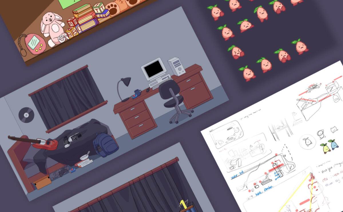
To illustrate the setting surrounding a 2D cutesy digital pet, I wanted to create a more clear vision of how to build the level. I wanted to base it on a cohesive room that matched the story, so I made a persona of the digital pet owner.

Collectively as a team, we brainstormed ideas by looking at 2000s themed teenager rooms and brainstormed what would be inside ours. Forming a persona of the owner made it easy to think of decor, theming, and the overall atmosphere world and background.
Eventually, after we discussed what objects to include, I started on the level design. I roughly mapped out where the player would travel in conjunction with the items we had thought of in the persona. For example, books, bowls, and the water bottle were used as platforms.

Initially, we had the idea of a character creation screen where it took the perspective of the owner. But we were not able to implement this screen due to time constraints.

I proposed that the player starts in a pixelated-style shoebox. Somewhere that was cohseive where typical childhood memiors, like wooden building blocks, set the scene and are elements the player can interact and jump on. When the player makes their way out of the shoebox, they are greeted with the room of their owner, who is a typical 2000s, music-loving, and messy teenager.

The background design of the shoebox and bedroom were cohesive. The design of the shoebox being very vibrant and innocent in contrast to the bedroom being dark, dull, and messy creates a fitting atmosphere for the story. It demonstrates the personality of a disorganized, and messy teenager and explains how the pet was long forgotten.
Programming
Learning Unity's language was a new experience. It consisted of a lot of new terms I simply needed to memorize, but programming a 2D platformer was very straightforward. It was the mechanics that were harder to implement.
I programmed the player's input for movement, all of the objects' hitboxes, some in game physics to set the pace of the game, and had the camera still or following the player according to the room.
Design Issues
When first implementing the backgrounds, I noticed that before the player even can move, there was no clear pathway. This made it very difficult to differentiate where they could and could not jump. An unclear objective and an undiscernable path takes away from an enjoyable experience.

I proposed to make the background a little more dull with less bold and muted colors to emphasize a more clear pathway for the player. Unfortunately, due to the lack of time, the art team was unable to update the backgrounds for more clear platforms. In addition, the audio was unfinished so there were no sound effects or music playing when the player traversed the level.
Finished Product
By the end, our team had created a fully functioning level with an objective, basic character functions, seamless transitions, platforms, gravity, and themed visuals.
Takeaways
This project was super motivating and fun to work on! I had so much fun pitching ideas, forming concepts, and game mechanics with the rest of the group that it was hard to settle on an idea that could be realistically completed in 2 weeks. Time was a big constraint, but I believe we were able to put down our ideas and execute the most important ones.
Balancing schoolwork and this club's project on top of learning how to program using Unity was definitely a challenge to manage in a 2 week time span. Overall, I learned a lot about how all the different aspects of the game (visuals, mechanics, audio) contribute to create a fun experience.I now have a better understanding of the process of game design, but I moreso really enjoyed learning how each aspect is considered in programming everything we see and touch.
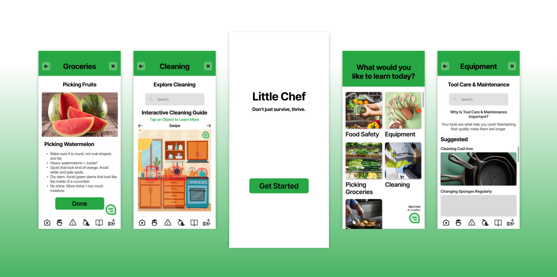
Little Chef App
Hackathon ━ A 36 hour design challenge, Diamondhacks is hosted by ACM @ UC San Diego
Timeline ━ 36 hours from April 5-6, 2025.
Team ━ Paris, Omar, Catherine, Mandy
Role ━ UX Designer
Tools ━ Figma, Github
Background
Objective
Out of the several prompts Diamondhacks offered, we chose Robinhood Reimagined, which was to create an application that was informative and helpful to the public.
Brainstorming
Since we had only a day and a half to do work, time was already running out. I got us started by pulling my notebook out and writing down all of our ideas that we had been brainstorming. Eventually, we settled on an informative cooking related app. Inspired by the perils of of our collective dorm experiences.Next, I wanted to define our target audience and the goals and functions of the app.We defined our users as:
- People new or not as knowledgable at cooking/living on their own (ie: recently moved out)
- College students
- KidsThe goal of our app was to educate on:
- Proper food safety
- How to use kitchen equipment
- Cleaning properly
- Picking the best groceries
- Providing general cooking demonstrations for common foodsWith our functions defined, I really wanted to define a few examples to ensure there was enough depth to each category, to which I created a FigJam board and our team formed a few examples for the general flow of each category.

Wireframing
To get some ideas for each page layout, I tried to draw at least 4 different variations of the screens to have something to choose from. From there, I asked my team members which they collectively liked the best and how to improve them.

After the designs of the page categories were decided on, I i decided I needed to just get started on prototyping in Figma since we were running out of time.Roles
While our group has 4 people, Omar, Mandy, and Catherine had no experience in creating an app, so they all focused on trying to figure out the front and back end development on a web app.This meant I was prototyping everything on Figma alone.
Prototyping Iteration 1
First, I started by creating a style guide for more consistency throughout the design.

Fonts
I chose the bolded font Inter as my headings, subheadings, and as button text because it served as a readable and distinct typeface for things like titles and headings. I then chose the Arial font for my paragraph text and longer descriptions because it is much easier to read.Colors
Even though I mostly did use just green shades throughout my prototype, incorporating the other colors that complemented each other gave me a diverse range to choose from.After the designs of the page categories were decided on, I needed to just get started on prototyping in Figma since we were running out of time.

By the end of Day 1, I had gotten my first iteration done. I wanted to do some user testing for any feedback on the flow, functions, and visuals, so I decided to ask a few friends what they thought.
Iteration 2
The next morning, we had until 1:00PM to finish and submit our design.
I started working on the second iteration based on the feedback I had gotten the previous day.I also decided to implement a chatbot feature, to which I used Letta AI to build.Creating Mini Chef - AI Personal Assistant Chatbot using Letta AI
The first step in creating this chatbot was creating a human persona for the chatbot to answer to. I described the human persona as our app's characterized target audience, which includes people new to cooking or living on their own, like kids or college students.The next step was creating the chatbot "assistant" persona. To guide the chatbot to answering in context this app would be used in, I also had to consider the context of where and why people would use this app. In a grocery store? In their own kitchen?I included several "if-then" statements to provide context for the chatbot's response. In addition, I also made its responses in a summarized in bullet point format so it would be quick and easy to read and gather all the necessary information.

Prototyping Iteration 2
The next morning, we had until 1:00PM to finish and submit our design.I started working on the second iteration based on the suggestions and feedback I had gotten the previous day. This included:- Placeholder images to guide the user & provide visual examples
- Provide images and descriptions of real information that would be displayed in the app
- Alignment and positioning of text
- Implementing a scroll bar or something to indicate that you can scrollI also decided to implement a chatbot feature, to which I used Letta AI to build.Creating Mini Chef - AI Personal Assistant Chatbot using Letta AI
The first step in creating this chatbot was creating a human persona for the chatbot to answer to. I described the human persona as our app's characterized target audience, which includes people new to cooking or living on their own, like kids or college students.The next step was creating the chatbot "assistant" persona. To guide the chatbot to answering in context this app would be used in, I also had to consider the context of where and why people would use this app. In a grocery store? In their own kitchen?I included several "if-then" statements to provide context for the chatbot's response. In addition, I also made its responses in a summarized in bullet point format so it would be quick and easy to read and gather all the necessary information.

Before I knew it, it was already time to submit and prepare our demo and pitch for the judges.Here is my Figma prototype:
Mandy, Catherine, and Omar worked on the front and backend development, and since it was only able to be hosted on their laptop, here is a video of their work.
Reflection
I was surpised at how much I was able to accomplish in such a short amount of time by myself. Working with 3 other people in this short time was very fun! We all got ice cream afterwards.
Miscellaneous Projects
Some projects on the side, usually for fun.

Formula Drift Poster

Daytona 675R Wooden Memento

Hominid Skull Identification Poster

Formula Drift Wooden Memento


Kendall-Frost Marsh Reserve Composting Guide Poster
Past Projects
ENG100D (Spring 25) - Building a composter for the Kendall-Frost Marsh Reserve Field Station
ENG100L (Spring 25) - Designing an app for Menolearn, an app about educating women about menopause.
ENG100L (Fall 25, again, but this time...) - Participating in the 2025 Design for Global Health Competition. Developing dental health solutions for elementary school kids on Bohol Island in the Philippines - Our solution was a mobile Jeepney dental clinic called DentAlon!
Hi, I'm Paris Tan and I'm originally from the Bay Area.
I was previously a student @San Jose State Unviersity studying Psychology with a minor in Interaction Design.
I'm now a 4th year transfer student @UC San Diego majoring in Cognitive Science with a Specialization in Design and Interaction.
A big aspect of why I love UX design is that it can apply to anything. Physical or digital, auditory or visual, I believe user experience is an important factor when it comes to being able to use & enjoy an experience.ps: my favorite design of all time has to be playing cards!


Outside of Figma, I love crocheting, (trying to) 3d print silly and useless things, thrifting, photography, learning and working on anything mechanical!
I love to tinker & work on things with my hands + disassemble things just to see how they work. Generally just love figuring out how and why things work the way they do.
