Physical prototyping ✧ Digital design
POP Mart Interactive Kiosk
OVERVIEW
POP Mart is a toy company famous for its "blind boxes," or collectible figures sold sealed.
Customers are drawn to stores worldwide for limited-edition figures, models frequently out of stock, and the thrill of not knowing what's inside. But high demand spirals into more issues that deter customers from shopping in store. Our objective focuses on creating an interactive kiosk that solves in-store issues.
RESEARCH
Defining and diving deeper
Starting with online research was a good way to get a broad understanding of opinions and experiences before conducting in person visits and research. I looked over reviews on several different platforms, forums, and specialized POP Mart specific social media groupchats. This provided us insight on common pain points such as the long line, especially during new releases, and stock uncertainty, but I needed to dig a bit deeper as they were mainly expressions of frustration.
Through observing and interviewing on site, I was able to press for more specific details like motivation and reasoning for certain actions or behaviors. This was a crucial step as it allowed me to figure out when and why users were having specific issues.


A typical line outside the POP Mart store
THE PROBLEM
From the User's perspective
When a user considers going to their local POP Mart store, they face a high starting price, long lines on any given day, and no way to know if what they're looking for is even in stock. A user has to debate spending their time on an experience that isn't even guaranteed or simply passing. I identified this uncertainty of waiting without knowing as the biggest deterrent for keeping customers from shopping in store.
Narrowing it down:
Lines are almost always long, especially on weekends
Figures are pricey starting at $20
Stock availability is confusing and unclear
✧ Customers do not want to wait in long lines, especially just for a chance that a specific figure is in stock.
THE SOLUTION
Designing solutions that only work because the kiosk is physical
After our research narrowed our issues down, I wanted the kiosk to not only directly address those issues, but also in a way that leverages its physical aspect to offer exclusive features or events that would only be available in person.
Solutions to each issue:
Lines are almost always long, especially on weekends -> Remote waitlist system
Customers were already waiting in line just to find out if a wait was worth it. A remote waitlist lets users join the queue without physically standing in it, allowing them to commit without the hassle of standing in it.
Figures are pricey starting at $20 -> Kiosk promotional discounts
Price was a barrier, but it couldn't be solved with a digital coupon. Instead, we used the kiosk to host promotions and an interactive game that creates a unique, memorable experience. This gives customers something to look back on and encourages them to show up despite the price tag.
Stock availability is confusing and unclear -> On-site stock availability
One of the most present issues for customers was the uncertainty of a figure in stock. Since this feature is not available on the website, this forced customers to make the trip to the store and wait in line for the sole purpose of checking if a figure was in stock since that information is not available online. Letting them check availability at the kiosk before having to commit to a long wait turned a gamble into a a promised solution.
With these three functions clearly defined, the next challenge was transforming them into an interface that is functional, aesthetic, and intuitive.
PHYSICAL DESIGN
Building the grounds for the digital face
I opted to start building the physical platform early as it would help form out the flow, information architecture, and scaling for the digital interface. Having our clear issues identified and a physical platform, I was really excited to design this kiosk as a system that not only worked around user needs and business priorities, but also the environment it needed to be placed in for a memorable interaction.
Storyboarding
On figuring out where a kiosk belongs in the physical space, storyboarding provided another perspective to help immerse and empathize with the user. We created several different personas and scenarios to visualize where a kiosk might fit in and tested mock solutions based on our research. The feedback from our user tests were positive with some tweaks made, so our first digital prototype was created. skip to digital ->

Storyboards & Scenarios
Limitations
As the only one on my team working on building and designing the physical prototype, I had to work around using as little wood as possible, integrating our own iPad, and designing, building, and assembling in a short amount of time while also working on the digital design.
Initial Planning
Since the physical form directly affects how usable the digital interface feels, I wanted to create a solid base to work around. My goal was to design around the iPad, which meant that it needed to be structurally stable, easy to prototype with, and have strong visual branding. Some factors I took into consideration were the height, angle, and even the glare of the screen because it can affect the usability and experience as a whole. To start off with my first rough idea, I made a cardboard prototype to test the rough dimensions and feel at which users would be able to interact with the screen before committing to the design.


Sketches, measurements & Cardboard mockup
Final Cutouts
As I was learning how to use the laser cutter, I was also using Inkscape to create the design. Wanting to make this model as flush as possible and only having one chance to cut, I was very meticulous on the dimensions. Even the smallest factor like the wood burning from the laser cutter affects the fitment of the parts coming together. To make the most of my one panel of wood and allotted time to cut, I printed different buttons and various sizes because I wasn't sure what would look best on the assembled kiosk.


Laser cut parts + assembled & glued kiosk
The Finishing Touches
Every decision on the physical side was intentional and made with the digital experience in mind. And after cutting, the pieces were glued together then painted to match POP Mart's branding. And I am proud to say that I did an amazing job with the measuring because it was perfectly flush. :)
Note: This was done in conjunction with designing the digital half, but for the sake of continuity, all physical design is included here.
DIGITAL DESIGN
Design & Iterate
3 Functions -> Dozens of sketches
Before prototyping anything, establishing the flow and information architecture create a functional and straightforward experience. Sketching out dozens of screens allows the ideas and concept to exist first, and that helped us decide our flow.

Lo-fi
After building our base interface, we created several variations for our first flow. With some user testing and feedback, I polished and kept reiterating on a version that would eventually be used for in person testing.
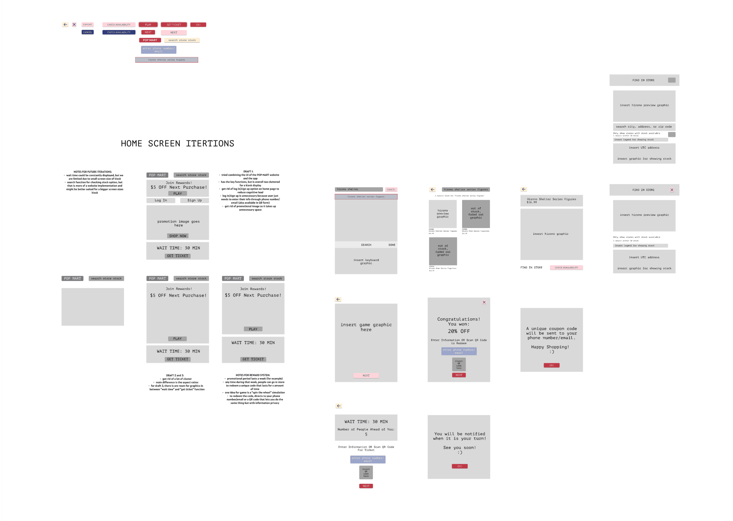


Hi-fi & Iterating
From our base, we designed, tested, retested, and iterated 3 times over user feedback to polish the interface. By the third iteration, the physical kiosk had been built and painted, which let us test it as a combined experience instead of two separate parts. This was crucial because the physical interaction is half of the experience.
We ran three interviews with users interacting with the full prototype of the screen in kiosk together to catch any problems that either was unique to that combined experience.
During these interviews, we asked users to complete tasks that incorporated the kiosk's primary functions.:
Get a ticket for the waitlist
Win a coupon for your next purchase
Check availability of an item in store

Results & Changes
Since most feedback was based off of lack of clarity and feeling lost,
I added a visual entry point without the clutter
Our search menu was blank and some users did not know what to search for, giving an entry point helps users understand what they can find and where to start.I gave users concrete feedback to their actions
When users interacted with call-to-action buttons/fields, there was a lack of feedback that gives confirmation to the user. I made clear changes to ensure that users were informed of the result of their action.I improved clarity with enlarged text and integrated color contrast while staying on brand
Screens such as our product menu and home page lacked the clarity in communication its main purpose. Item labels were bolded and made more legible, sold out products now had a slight grey overlay to easily signify being unavailable, font and sizing was easier on the eyes, and screen aesthetics were changed to look more cohesive and on brand. I improved these items to be aesthetic yet still functional at a glance.


FUTURE ITERATIONS
Designing for one user when the real target is a crowd
The design of the current kiosk represents the concept of the experience and interaction of interface on a smaller scale.
Initially, I wanted to design a more immersive kiosk that was able to be functional, but emphasized in a way that would be usable by the target audience I had researched and interviewed. Due to our limitations on our physical model and screen size, I had my heights set higher when designing both the digital and physical aspects.
Mainly due to constraints on materials and time, the current prototype is more conceptual in its interaction model and three core functions, but it only performs at a the scale of a single user at a time. But the problems we directly observed during research weren't addressed to the scale of the long lines around the mall. If this kiosk were built for an actual location, it would need to be designed for a crowd.
Intended Design
A kiosk built for this scale would need to function like one; similar to mall map directories. Its size and location would benefit from being positioned outside the store rather than inside as our tabletop version does. It would would aim to serve multiple people at once past the single user scale.
Some future functions for thought:
A larger constantly visible queue display
Utilizing a large screen bypasses the requirement to walk up to it, paired with a constantly updated wait time visible from a distance lets people passing by make a decision without interrupting.A loyalty program layered into the reward interactions
Expanding past the claw machine game that created a memorable moment with a loyalty system would give customers a reason to come back, turning a one time experience into something to look forward to.Complex sorting and search options by character or collection
POP Mart carries a very diverse inventory that would benefit from a better way to filter and find what you're looking for.
TAKEAWAYS
So what did I learn?
The assignment was to design a kiosk, but the real problem was designing an entire system to work as one.
Rather than treating the physical structure as just a mount for the screen, I built around it and let its constraints shape the interface instead of the other way around. Decisions on the physical end that seemed purely structural like the screen angle, glare, and height directly affected how usable and enjoyable the digital experience felt once someone used it.
Since most of my design experience was on the digital end, the physical side helped me think about things in a different light. It forced me to think about physical constraints that don't exist on the digital side and to create complementary parts that work as a system rather than being two separate parts.
In six weeks, I identified real problems, built and tested a physical kiosk by hand, and designed and iterated a digital interface based on hard evidence to make a unique interactive kiosk.
I've learned to understand the space and what I had to work with before designing for it. And more importantly, this experience has really helped me think about solutions with a more open mindset that I want to bring into new projects going forward.

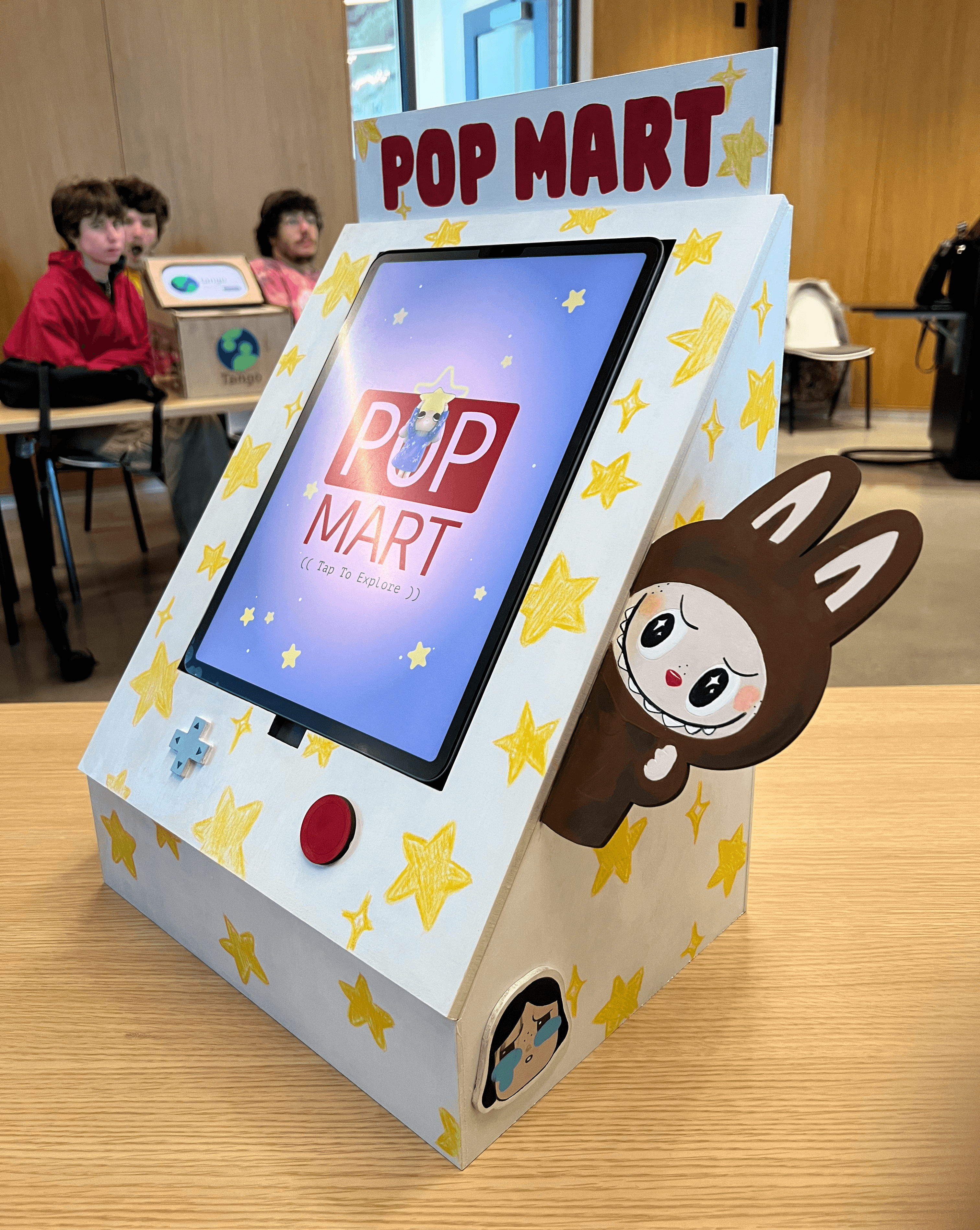
Finished kiosk during a demo day!
✧